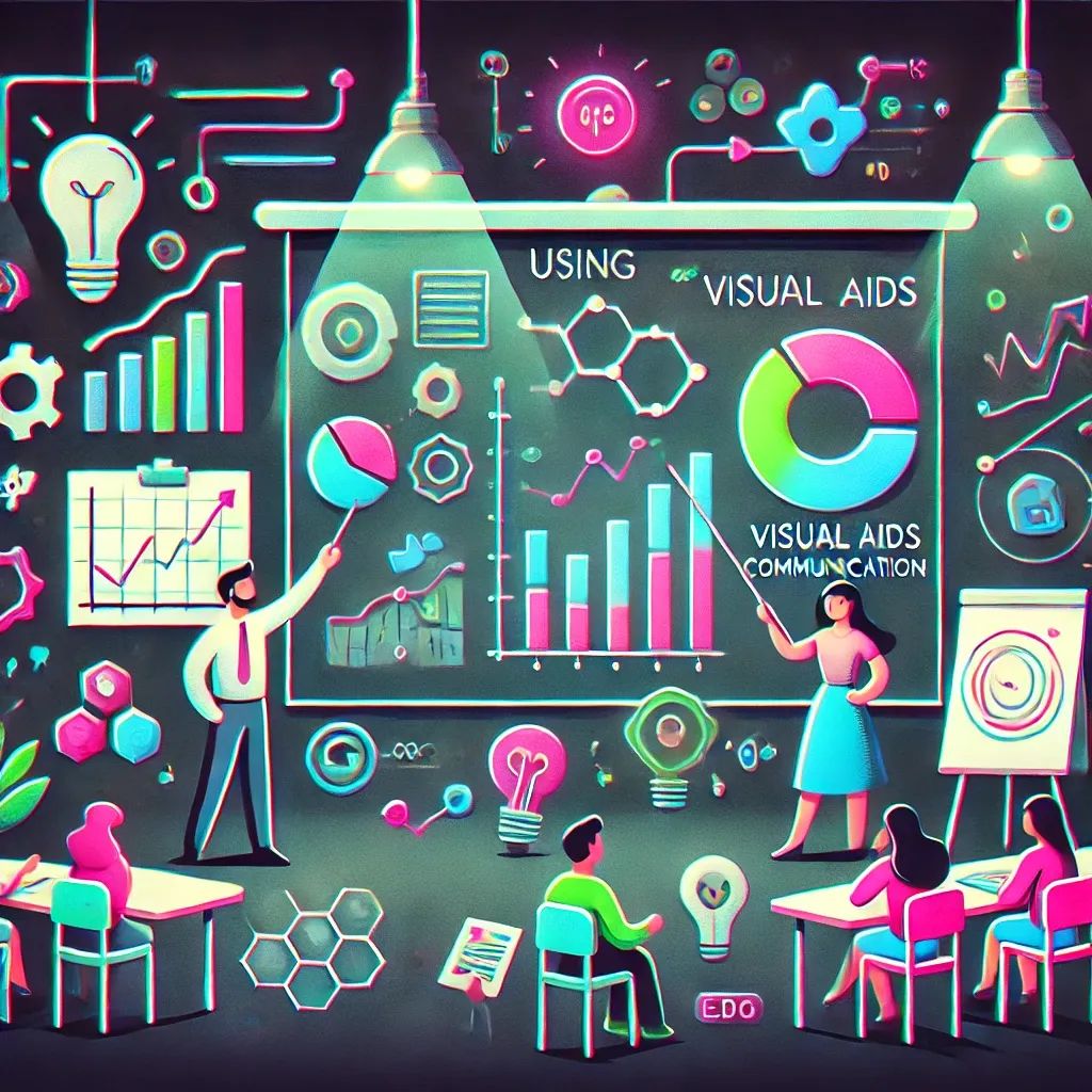
Using Visual Aids for Effective Communication
Using visual aids to simplify complexity, engage stakeholders and limit misunderstandings.
They say a picture is worth a thousand words, and nowhere is that truer than in software development. Let’s face it—trying to explain a complex system without visuals is like describing quantum physics over the phone. Spoiler: it won’t go well. Whether you’re breaking down an architecture plan or pitching a new feature to stakeholders, visual aids are your secret weapon. Collaborating with stakeholders becomes infinitely smoother when you have something to point at. In this article, we’ll explore why visual aids are so valuable and how to use them without driving your audience (or yourself) crazy.
Why Visual Aids Matter
Simplifying Complexity
Software concepts can be mind-numbingly complicated—even for seasoned pros. Now try explaining them to someone with no technical background. It’s like walking them through a maze blindfolded. Visual aids break complexity into bite-sized chunks, saving everyone from cognitive overload. Flowcharts, diagrams, and mockups make even the messiest system easier to grasp. Communicating complex ideas becomes way simpler when there’s something to look at.
Engaging Stakeholders
Most stakeholders don’t care about the nitty-gritty technical details—they just want to know what’s happening and why it matters to them. Visual aids keep them engaged, making it easier to hold their attention and ensure they walk away with a basic understanding (or at least pretend they do). Whether it’s a whiteboard sketch or a polished mockup, visuals make your message more accessible. Effective communication is about keeping people tuned in, not zoning out.
Reducing Misunderstandings
Ever had someone nod along like they totally got it—only to do the exact opposite later? Yeah, visual aids can save you from that nightmare. A diagram or mockup provides a shared reference point, minimizing the chance of misinterpretation. Clear communication works best when everyone’s looking at the same thing and interpreting it the same way.

Types of Visual Aids
Flowcharts
Flowcharts are lifesavers when you need to explain processes—whether it’s a user journey, an algorithm, or a deployment pipeline. They make sequences easy to follow without overwhelming your audience. Think of them as GPS directions for complicated workflows—just without the “recalculating” every time someone messes up.
Diagrams
There’s a diagram for everything—entity-relationship diagrams, system architecture maps, and network diagrams, to name a few. The key is choosing the right one. A system architecture diagram, for example, can help non-technical stakeholders understand how the app’s different parts interact—without dragging them into the deep end of tech jargon.
Mockups and Wireframes
When pitching a new feature or UI design, mockups and wireframes are a game-changer. They give stakeholders a sneak peek at the final product and make feedback sessions way more productive. With mockups, you can squash misunderstandings before development even starts—saving you from the dreaded “This isn’t what we expected” conversation.
Whiteboarding
Sometimes, the best solution is the simplest. Grab a marker and hit the whiteboard. Whiteboarding sessions are perfect for brainstorming, collaborating, or explaining concepts on the fly. They’re quick, interactive, and way less formal than PowerPoint presentations—plus, there’s something satisfying about scribbling out ideas in real time.
Tips for Using Visual Aids Effectively
Keep It Simple
Visual aids are meant to make things clearer, not more confusing. If your flowchart looks like a spiderweb or your diagram resembles abstract art, you’ve lost your audience. Stick to the essentials—too much detail defeats the purpose.
Tailor to Your Audience
Not every audience needs the same level of detail. Developers might love the nitty-gritty technical diagrams, but stakeholders? Not so much. Adjust your visuals to fit your audience’s needs, cutting jargon where necessary. A good visual aid meets people where they are—not where you wish they were.
Use Tools Wisely
There’s no shortage of tools for visual aids—Lucidchart, Miro, Figma, or trusty old PowerPoint. The right tool depends on what you’re trying to achieve. And remember, it doesn’t have to be fancy to be effective.
Combine Visuals with Verbal Explanation
A great visual aid isn’t a replacement for clear communication—it’s an enhancement. Walk through your diagrams, explain key points, and invite questions. It’s all about making sure the message lands. Visuals plus words equal clarity.
Conclusion
Visual aids are the unsung heroes of effective communication. Whether you’re explaining architecture, pitching a new feature, or walking through a user journey, visuals make the abstract concrete. Giving effective feedback becomes easier, and active listening helps ensure your audience understands your message. Just keep it simple, tailor it to your audience, and pair visuals with clear explanations. A good visual aid doesn’t just make things clearer—it saves everyone from endless back-and-forth and those awkward “Wait, what?” moments.